
By
Test Author
last updated
in Features
This page covers the appearance, elements & functionality of the Standard nav bar for the Responsive Theme
Navigation bar elements
Site Logo
- Will link back to the homepage
- Visible on desktop layout
- Visible on mobile layout
Site Strapline
- Optional element
- Visible on desktop layout
- Hidden on mobile layout
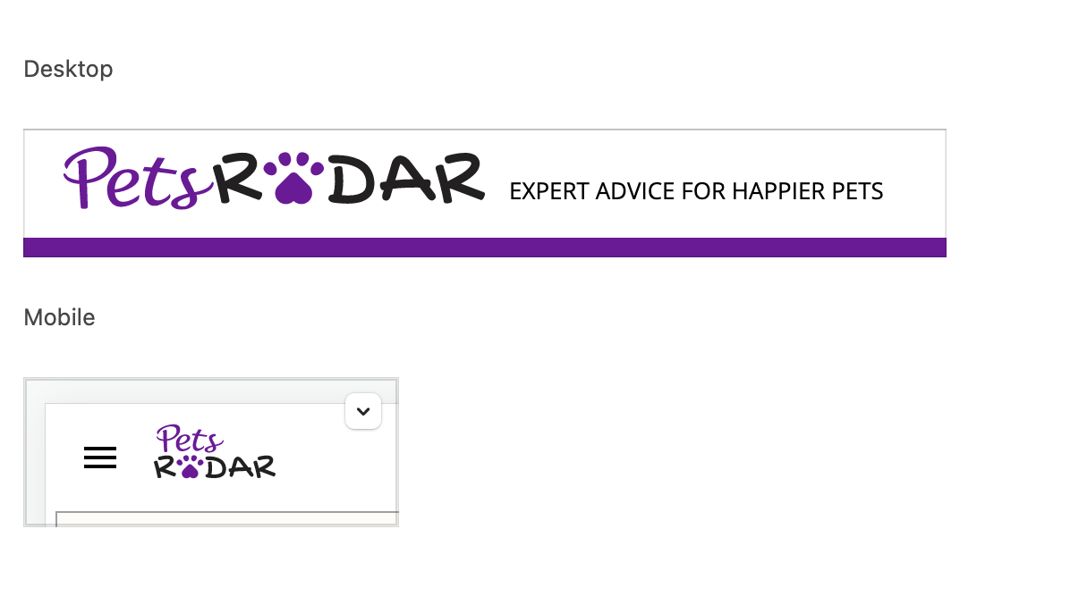
(Image credit: Future)
Region Selector
- Only used for internationalised sites
- Visible on desktop layout
- Visible on mobile layout
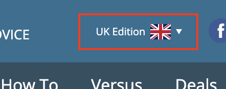
(Image credit: Future)
Socialite Links
- These link to the social networks for the site / brand
- Visible on desktop layout
- Hidden on mobile layout

(Image credit: Future)
Subscribe button
- Expands a dropdown that links to subscription options for the site
- Visible on desktop layout
- Visible on mobile layout
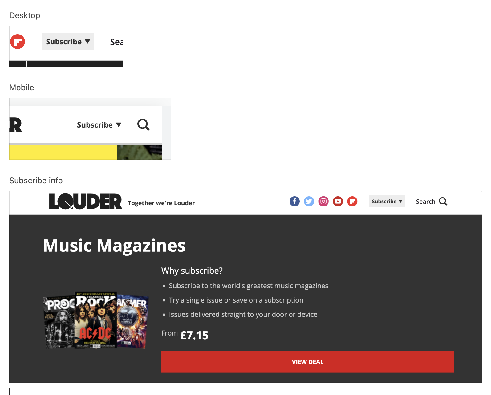
(Image credit: Future)
Search
- Clicking the search icon opens up a search field
- Visible on desktop layout
- Visible on mobile layout
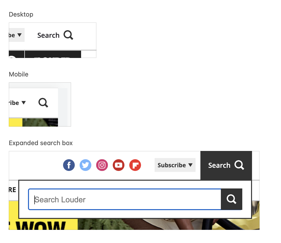
(Image credit: Future)
Content links
- Links to site content, List pages, Landing pages, Specific articles, External content
- Curated list controlled by editorial from the CMS
- Will resize to fit the width of the browser page, with links moved into the More menu if there is insufficient room
- Visible on Desktop layout
- Contained within the hamburger menu on mobile Layout
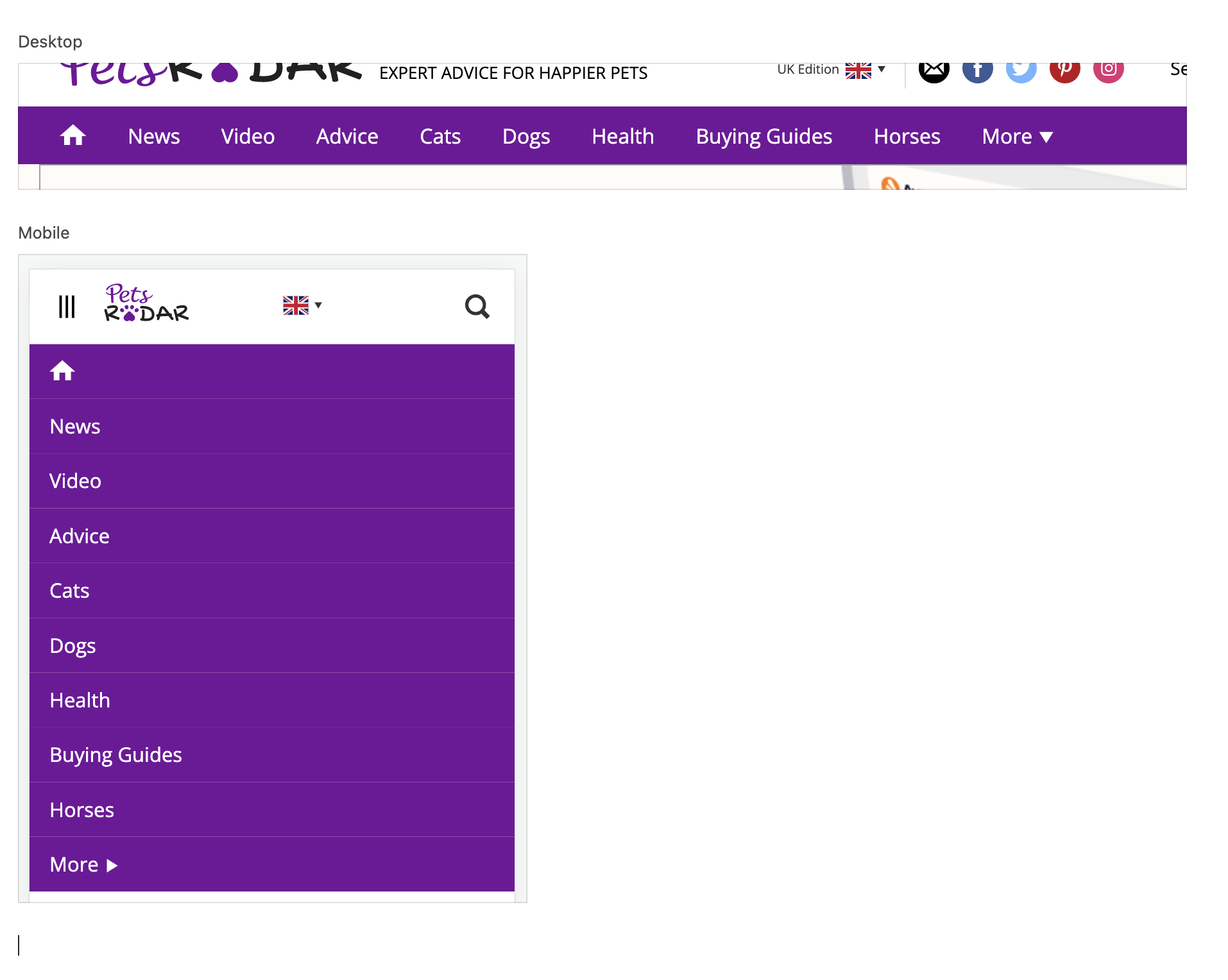
View of main nav on mobile layout
(Image credit: Future)
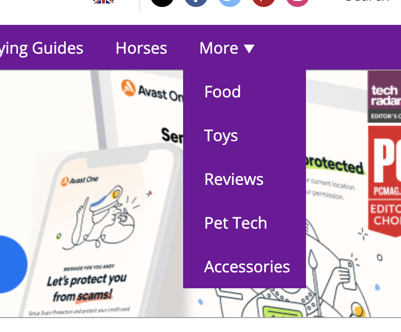
More dropdown menu
- Contains links to lower priority site content
- Curated list controlled by editorial from the CMS
- If empty in the CMS it is not visible on the site (unless browser width functionality mentioned above is triggered)
- Visible on Desktop layout
- Contained within the hamburger menu on mobile layout
(Image credit: Future)
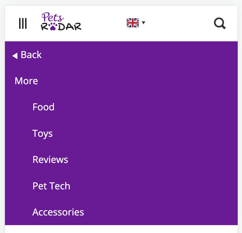
View of expanded more menu on mobile layout
(Image credit: Future)
Newsletter

Senior Editor
Lorem ipsum dolor sit amet, consectetur adipiscing elit, sed do eiusmod tempor incididunt ut labore et dolore magna aliqua. Ut enim ad minim veniam, quis nostrud exercitation ullamco laboris nisi ut aliquip ex ea commodo consequat. Duis aute irure dolor in reprehenderit in voluptate velit esse cillum dolore eu fugiat nulla pariatur. Excepteur sint occaecat cupidatat non proident, sunt in culpa qui officia deserunt mollit anim id est laborum.